SaaS Front-End - Experience Design
Software Product House
Background
This company develops enterprise insurance software, and had an existing suite of highly successful on-premise hosted admin and web applications, both internal and consumer-facing. With this project, this company wanted to develop a next-generation SaaS product aimed at providing cutting-edge digital experiences, enabling new capabilities for insurers and new possibilities for the consumer. I was the design lead for the first journeys to be built - quote-and-buy, account management and claims. Though this section is purely about the UX and UI efforts for this project, I also worked on the Service Design, planning and research.
From a design perspective this project was incredibly exciting - essentially a user-centred, green-field development where everything would need to be considered from the ground up. Some extra complexity was added by the fact that, as this was to be a SaaS offering, design decisions would need to be tempered with thinking around how configurable and extensible the design "architecture" should be. For example, considering it was to be a hosted application, what elements of design would remain as part of our "core", and what would be configurable by the customer to allow their own branding and customisation. As we were also to allow a seamless experience across devices/touchpoints, as well as incorporate the smart use of third party services, the scope of thought involved was at the same time exhilerating and daunting.
In broad strokes, my UX and UI design involvement covered the following areas - I will talk about some of them below, providing some specific examples where appropriate:
- Wireframing.
- Interaction design.
- Process.
- Prototyping - hi-fi static and interactive (HTML/CSS/JS).
- Alternative styling.
- Configurable layout, typography, styling/conventions (BEM).
From a delivery perspective I worked closely with the Product Management group to align thinking on the overall product roadmap, as well as working on implementation in sprints with scrum teams to deliver and iterate on prioritised product plans.
What I Did
Wireframing
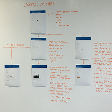
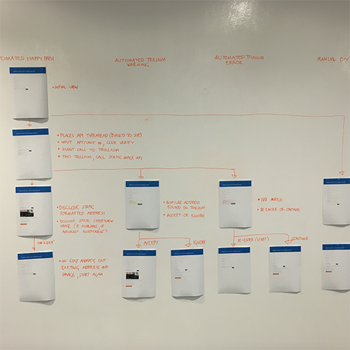
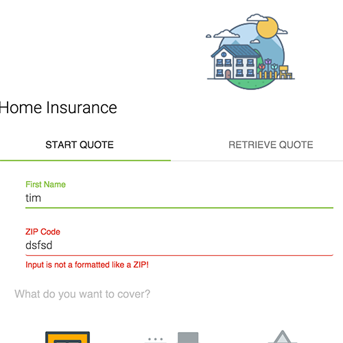
Working with the product owners on vision, and informed by user interviews, competitor analysis and technical feasibility discussions with developers, I initially iterated and refined designs for the desired functionality and flows on a whiteboard, with roughs done in Sketch. I then refined feedback into wireframes and conducted user testing to gather feedback (at this time the first steps were taken with the dev team to make high-level decisions on layouts, break-points, etc. as wireframes were created across four device "sizes").
Interaction Design
User feedback was used to iterate on the wireframes, with the outcomes being distilled into hi-fidelity mock-ups, allowing considerations around visual elements such as controls, etc. to come to the fore. Again, I conducted user testing on these, paying special attention to user flow through the application. Finally, I moved to creating and iterating on clickable prototypes using HTML/CSS/JS to bring the overall journeys to life. As the fidelity of the deliverables grew higher throughout the process, I made sure to share my progress and validate direction with a number of stakeholders - the PM team, the devs, and crucially the design team at large. Their critical feedback was invaluable in honing some of the design decisions made. Sharing the HTML/CSS/JS with the developers also allowed them to get a view into my thinking for implementation, and to take/adapt/change as they saw fit. As example of this is some work I did on adding animation for microinteractions on field elements: Example 1
Process
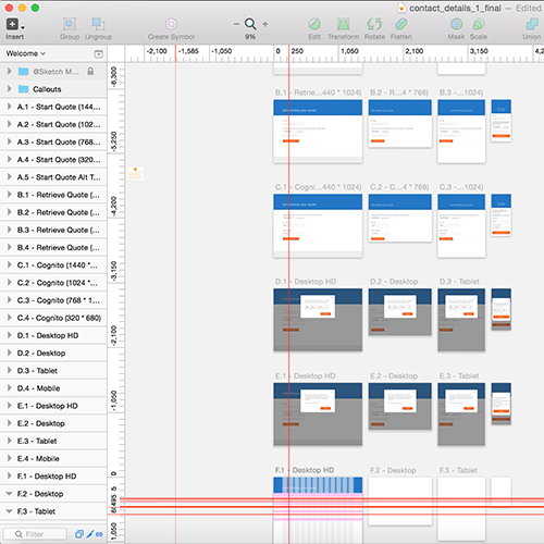
It is important to note that the full "bring everything to clickable prototype level" approach couldn't scale to cover every design for every journey, so once first passes were taken on a number of initial journeys, I conducted further detailed visual design and specification work with a combination of Sketch app, InVision and Zeplin (dipping back into hi-fi prototyping as appropriate). InVision allowed static mock-ups to be quickly stitched together into compelling ligh-weight prototypes for sharing with stakeholders. Zeplin allowed a very effective way of publishing auto-generated design specs to the dev team - I created pixel-exact designs in Sketch, then exported them to Zeplin (a cloud app), where they would then be shared with devs and used as specifications for dimensions, etc. Part of the benefit of this combination was that Zeplin would take certain characteristics of my design and generate rough CSS classes and style-guide elements that could then be re-used/re-purposed.
Prototyping
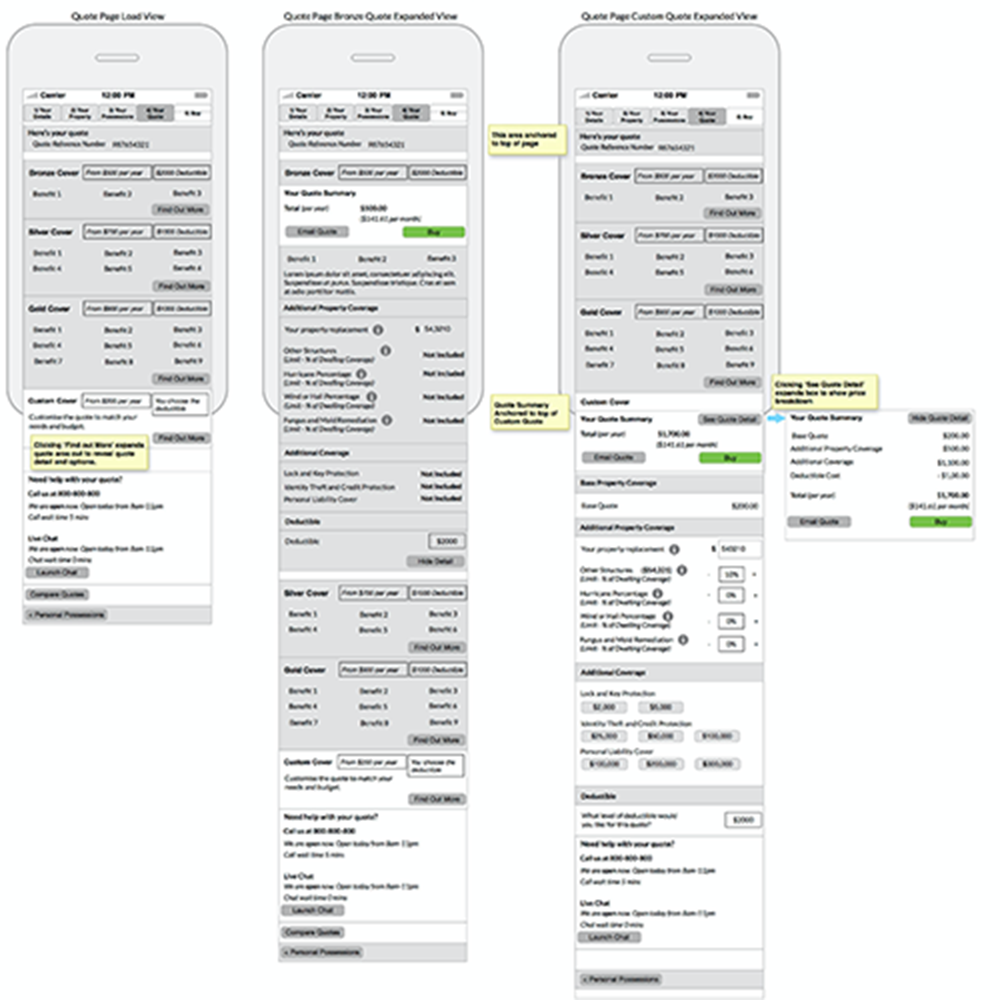
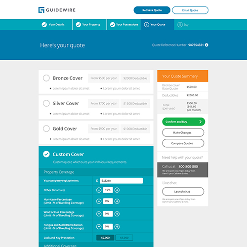
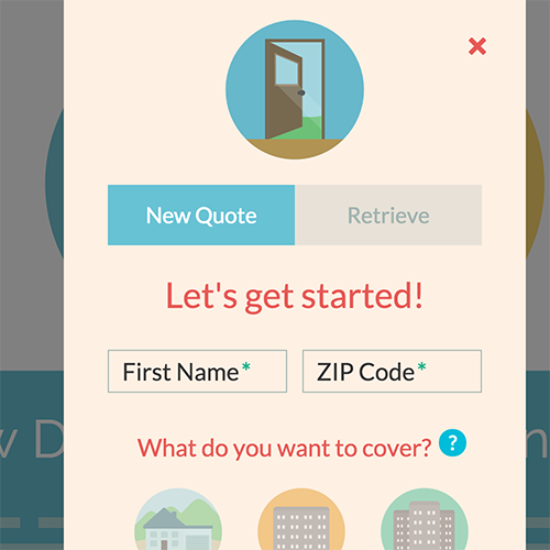
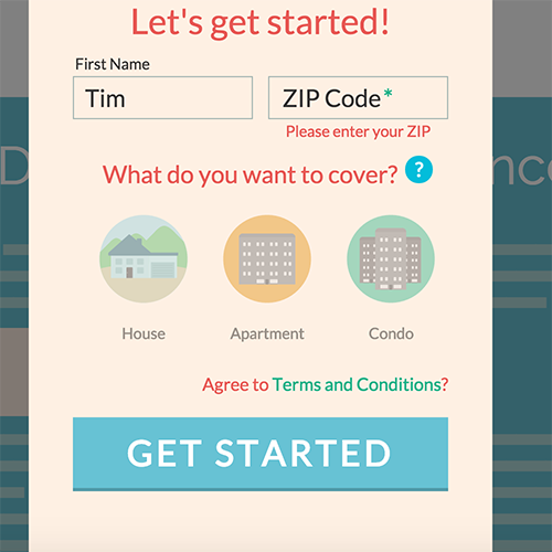
As a technique, hi-fi prototyping in HTML/CSS/JS really came into its own again for mocking-up specific scenarios where static visuals wouldn't suffice to convey interactions, state or movement. In order to communicate my ideas most effectively, get buy-in and achieve alignment in planning, I would create hi-fi "vignettes" of interactions - one good example of this was the quote screen. As the app was to support customer configuration based on specific requirements, I needed to think about different interaction types for things like pricing tables, etc. - areas where one solution just wouldn't fit all. Here are two examples of different takes on how pricing packages for products could be presented: Example 2 and Example 3
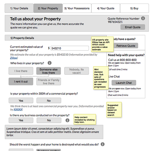
Another example of where prototying proved useful was in mocking-out the interaction with third party services. When trying to communicate the capabilities of these services and what impact they would have on our designs, I found that small interaction models were worth much more than many conversations. This interaction model (Example 4) mocked-up the interaction with Google's address look-up service, populating an address and map based on user input.
Alternative Styling
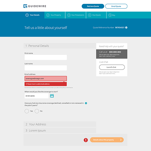
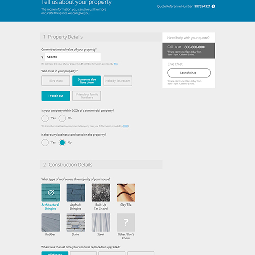
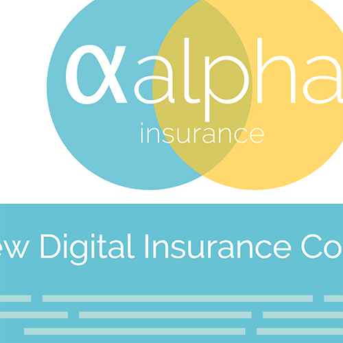
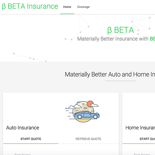
Given that a cloud application is, by nature, constrained in terms of how much it can be configured and styled, and given the need that customers would have to customise and brand their experiences, I was keen to show how much variance could and should be done "out of the box" with the applications. As an exploration into how different designs could be applied to a shared underlying set of flows and functionality I created a set of clickable prototypes in HTML/CSS/JS to bring this thinking to life. I dubbed these designs "Alpha", "Beta", etc. Alpha (Example 5) was an implementation using a flat, friendly style - something along the same lines as Intuit's TurboTax. Beta (Example 6) was an example using Google's material design (getmdl.io). Further prototypes communicated different styles, such as minimal, etc. These prototypes helped tell the story of how and to what extent our application could be re-skinned, and proved useful in underlining why customisation was important, and what needed to be in place to do it.
Configuration
The need for configuration gave rise to some of the more technical work I did on this project. I have already mentioned the client need for customisation, but what we needed to develop was the necessary vehicle to allow customers do this within our applications. The solution was to build our styling in layers, keeping some of that styling as core, extending this and allowing portions of that styling and configuation to be done by the customer, also in relative layers. To implement this, I worked in SASS to first create some basic building blocks of presentation, then drill into some of the finer aspects of configuration.
I had two areas in mind for the basic presentation components: layout and typography. For layout I created configurable standards for grids, containers and breakpoints for four different device contexts, then worked with dev to fully implement. Part of this was also creating standard classes for spatial relations, such as padding. For typography I lead the implementation of a SASS-based typographic scale system (like this), which could be used to rapidly change type scales across the application, or portions of the application. As part of the work on these two, I also tried to create a system for vertical rhythm, but eventually curtailed efforts on this, as it proved very difficult and time-consuming to try and apply such a system in a consistent way to a web-app (as opposed to a type-heavy interface such as a blog).
Apart from layout and typography, a lot of other SASS work on standards was done. Using methodology around naming-conventions borrowed from BEM, I created styling with variables, mixins and functions for a wide array of utilities, such as colour, HSL values, opacity, etc.
What Were The Outcomes?
The work I did made sure that design was in on the ground floor of a massive development from a company that came from an engineering-first background. The prototyping work I did on alternate styles helped change conversations in-house around styling and what was needed to support customer needs. The opportunity to work on a brand new development from the ground up was a massive learning-curve for me, and the experience has been invaluable.
I believe that the fluency in web technologies that I could bring helped to facilitate conversations around delivery with the dev team. My prior agile/scrum experience also meant that not only was I able to slot seamlessly into the scrum team, I was also able to "coach" some of the junior developers on how to work with design in sprints.
Apart from the deliverables and delivery model, the thing I was happiest with from this project was the emergence of a work process using Sketch, InVision and Zeplin. I was able to demonstrate the value of this workflow both internally with the PM group and externally with partners, as well as with the design team at large.