Loan Application - Experience Design
Bank
Background
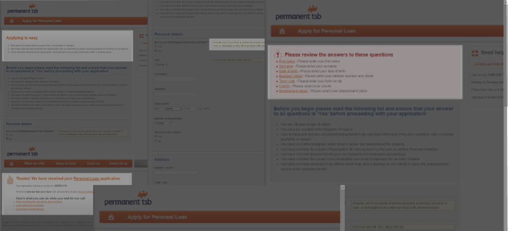
This company offer a range of financial products to consumers in Ireland through a number of different channels. The personal loan product is particularly lucrative for the bank - low-risk, smaller amounts over a shorter time with a high interest rate. Coupled with this, the distribution model is digital-first sales with self-service admin, meaning less headcount and material costs over time.
The only problem with this model was that their initial online sales touchpoint was poor, meaning that the conversion rates of potential customers was lower than it should have been. The recognition of this fact led to the inception of this project - the goal being to define an easy, attractive concept for online application submission for a personal loan.
What I Did
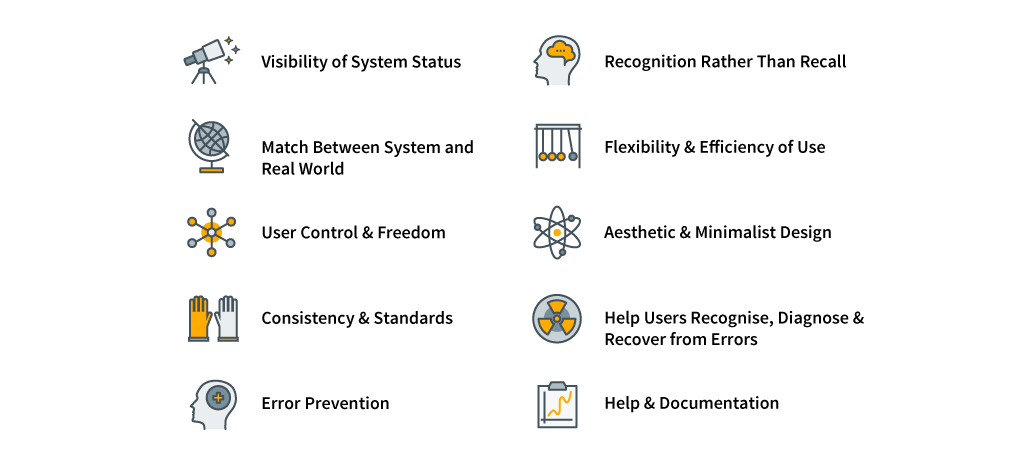
Time and budget constraints on this project meant that a suggested round of user research (usability on current offering plus interviews) couldn't happen. Instead, I decided to conduct an expert review on current shortcomings, and make suggestions for improvement. In order to apply some objectivity and structure to this process, I adapted Nielsen's 10 Usability Heuristics, and used these as a baseline to measure areas of weakness and opportunities for improvement.
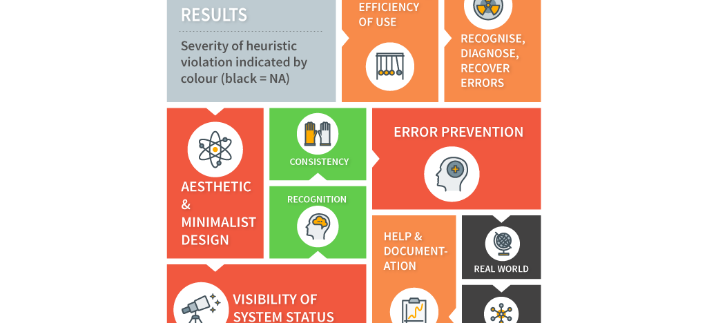
Following the review I documented the outcomes from this heuristic analysis, identifying the main causes for concern based on a scoring system. The three most contravened hueristics were "Aesthetic & Minimalist Design", "Error Prevention" and "Visibility of system Status". My main observations under these headings were:
Aesthetic & Minimalist Design:
- Overall purpose of form unclear to user.
- Form not remotely engaging.
- Form far too long given its aim (gather minimal detail for indicative loan quote).
- Dense blocks of Terms and Conditions that are hard to understand.
- Not responsive/adaptive - mobile experience very poor.
Error Prevention:
- Promts everywhere on form. Why necessary?
- Mandatory fields not indicated.
- Validation handled on page level, meaning a big "jump back" if validation failed.
Visibility of system status:
- No idea of progression/completion status.
- Unclear about off/online processes, how hand-off happens.
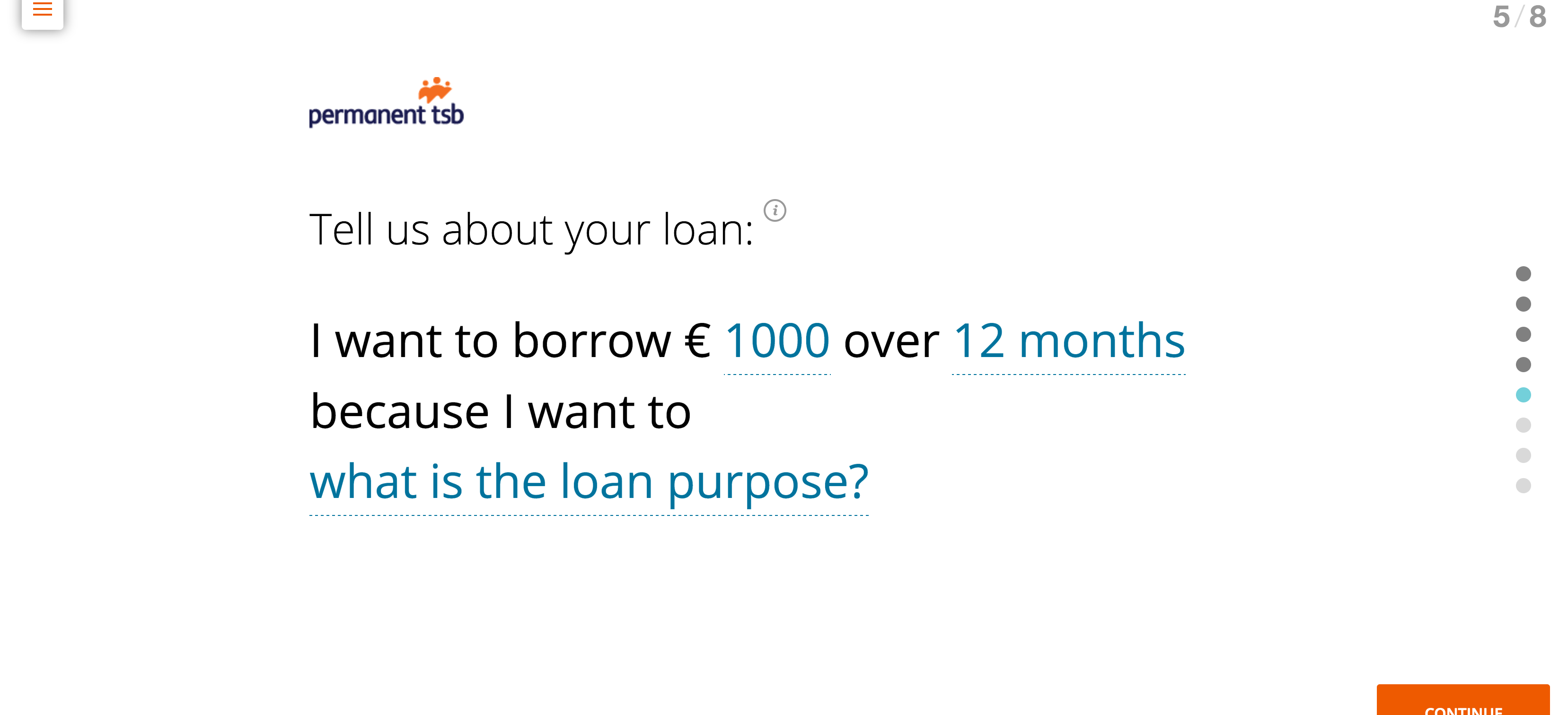
In the context of these findings, I conducted some desk research on best practices and lastest trends in topics like form-style, validation, animation, etc. At this stage I encountered the Typeform service - this uses a fresh approach of asking minimal questions at one time to reduce the cognitive burden of forms, and adding movement through smooth transitions and animations. "Conversational" UIs were also becoming popular, adding a note of natural tone, and potential for personalization. I wanted to add all of these aspects to the concept prototype. During desk research I also began to question the overall relevance of the form in light of its purpose; gathering data so that the bank can ultimately all them back. If that were the case, then the bank were making the process far too long and burdensome - this should be improved.
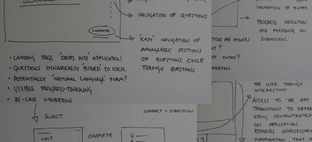
Given these desk research findings, I began to sketch designs on paper taking into account the characteristics I wanted to have in the concept prototype, reflecting the heuristics:
Aesthetic & Minimalist Design:
- Add a separate splash screen to guide the user (could also be tailored for campaign/segment).
- Change style and flow, include sense of "movement".
- Reduce the number of questions, think conversation.
- Deal effectively with dense text.
- Design with a "mobile first" direction.
Error Prevention:
- Allow access to help on demand, when needed.
- Indicate mandatory fields.
- Validate input immediately at field level.
Visibility of system status:
- Indicate progression/completion status.
- Let the user know what is happening - before, during, after.
I now moved to working in HTML/CSS/JS to prototype the concepts I had sketched on paper (the final prototype can be viewed here). All of the characteristics detailed above have been worked into the final deliverable, crucially though the overall process has been optimized to have a clear start, middle and end, with feedback all the way, including a final "review and submit" view.
What Were The Outcomes?
The concept prototype was received very well. The audience understood how adding contemporary features in a conversation-type UI could create a compelling experience. The shortening of the overall process in the prototype gave rise to some considerations around business processes optimization as well - it raised the question as to how to get the most value from the transaction for both the bank and for the customer.
Client
Bank
Techniques
Heuristic Analysis, Sketching, Prototyping
Technologies
Adobe Illustrator, HTML/CSS/JS
Example 1